Olive Joy
2014
Brand Design
Packaging Design
Client
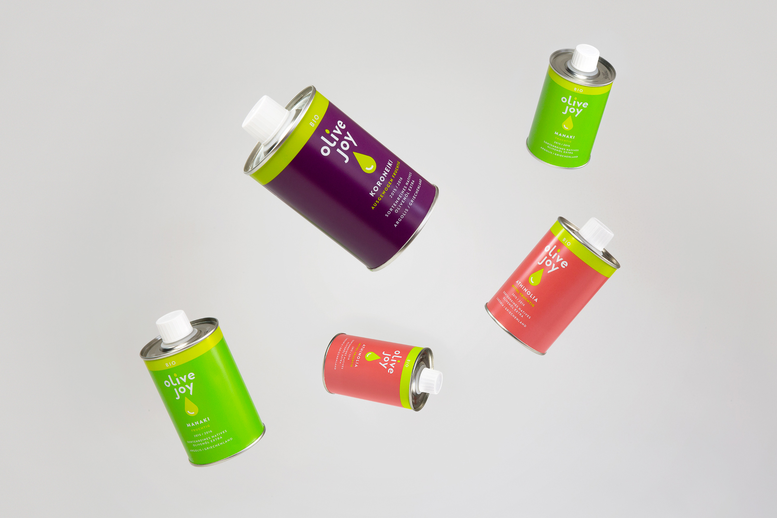
Olive Joy offers three high quality single variety Greek olive oils. The Company cooperates with carefully selected, often co-operatively organized producers and thus contributes to the production of olive oil in Greece in a fair fair and sustainable, but also modern and future-oriented way.
Mission
During my time at Navarra.is I supported Anna and Johannes of Olive Joy from naming to design concept to packaging design. The goal was to create a new modern olive oil brand that clearly stands out from the cliché of conventional olive oil bottle design.
Realisation
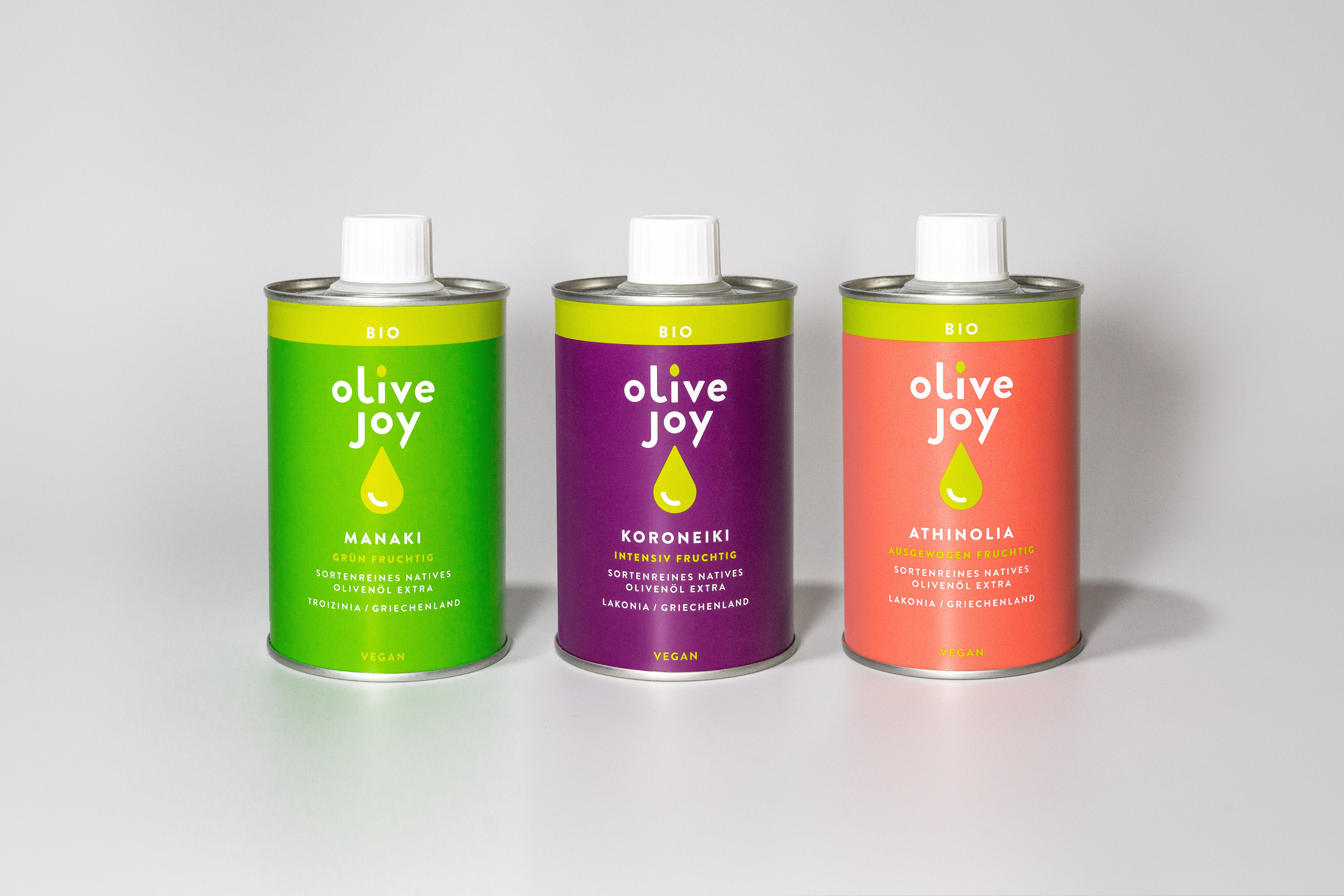
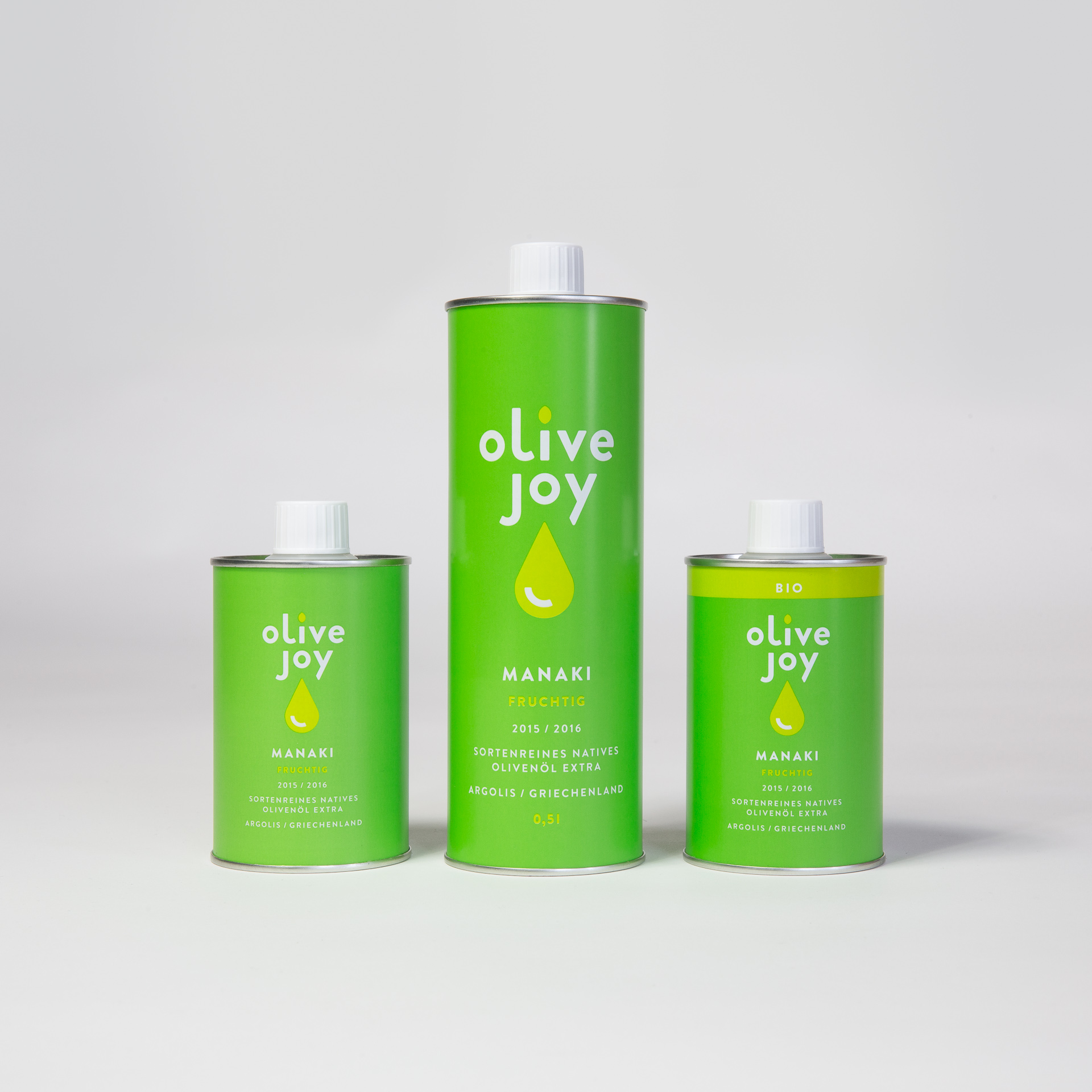
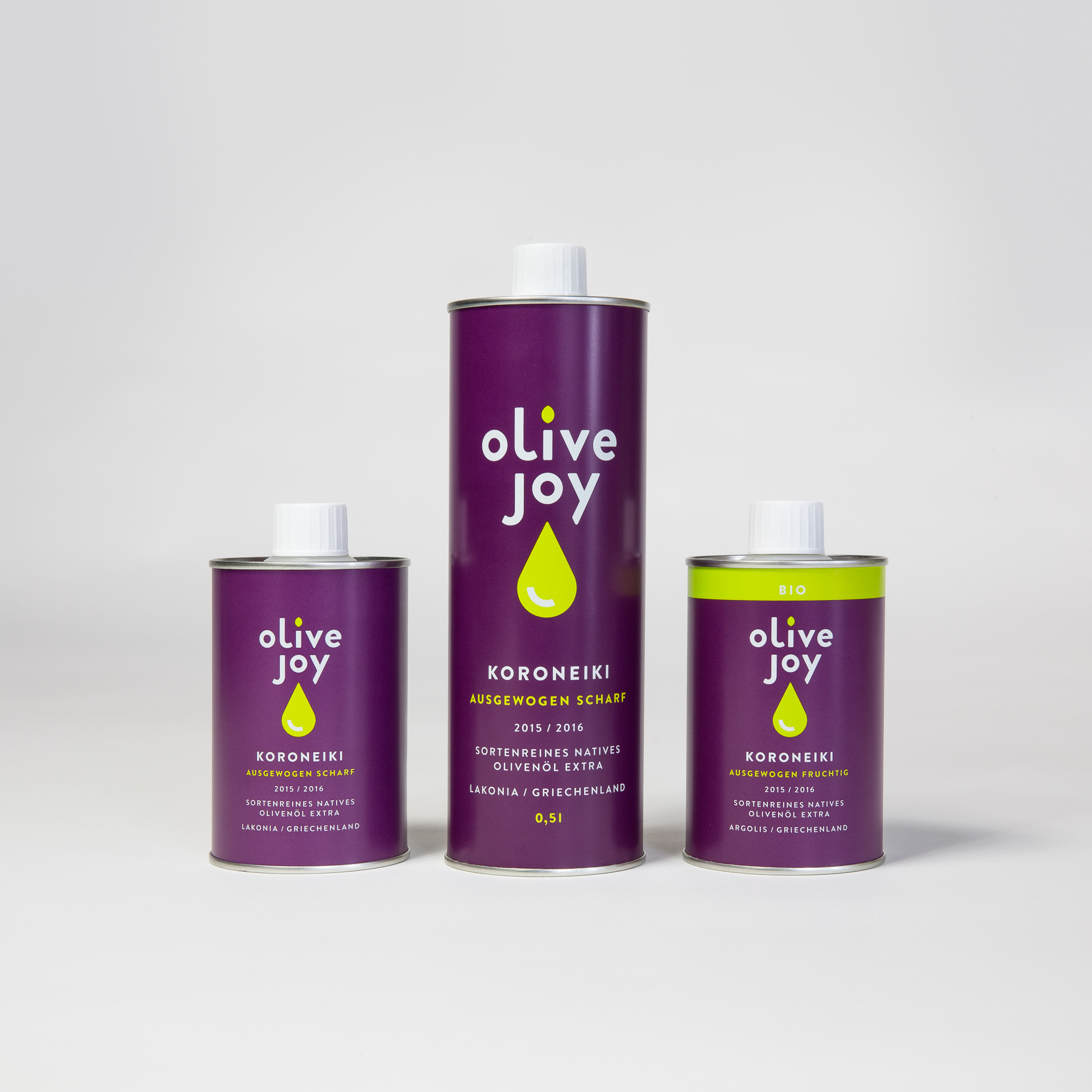
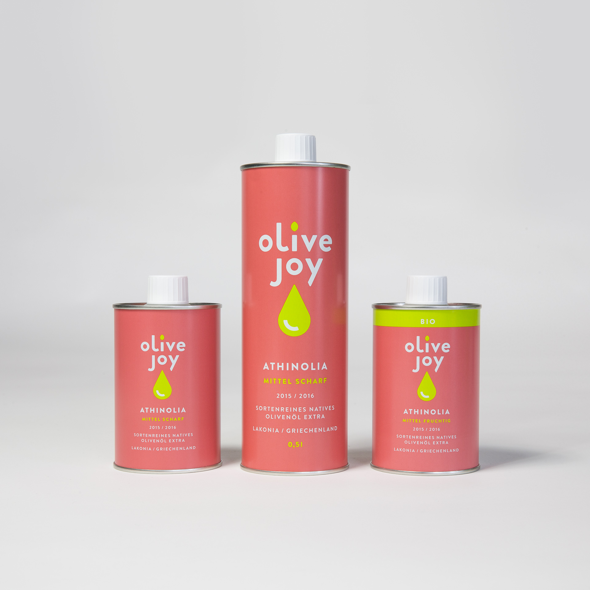
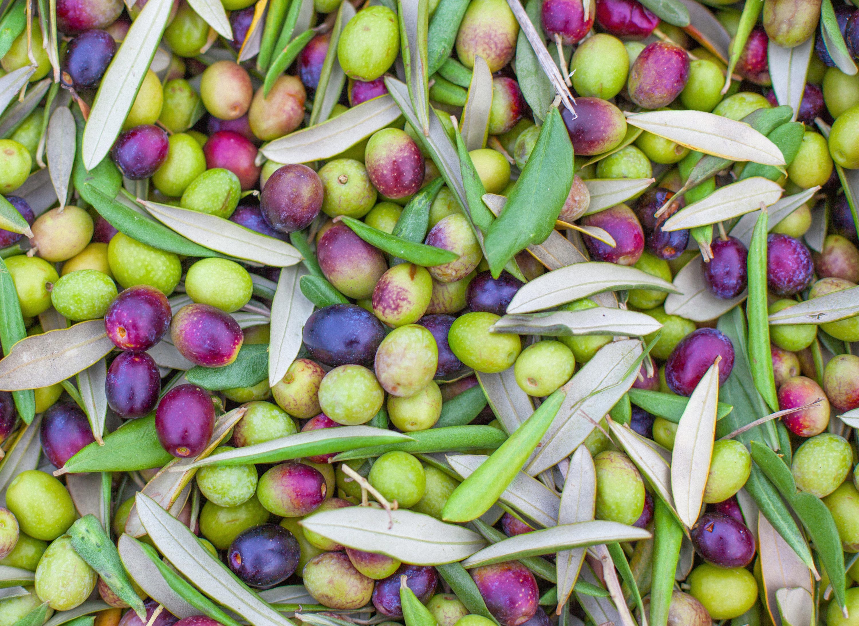
The symmetrical proportions of the logo perfectly match the extreme upright format of the cans. So the logo is not only the carrier of the brand, but also the central (typo-)graphic design element of the minimalist packaging. The logo’s oil drop shows a light reflex, which can also be interpreted as a smile and thus underlines the message of the brand name. Concerning the selection of the three varietal colours I was inspired by the colour spectrum of ripening olives. This resulted in the colour world of Olive Joy, which is not typical for olive oil — but nevertheless perfectly matches the theme.
Packaging
Color Inspiration
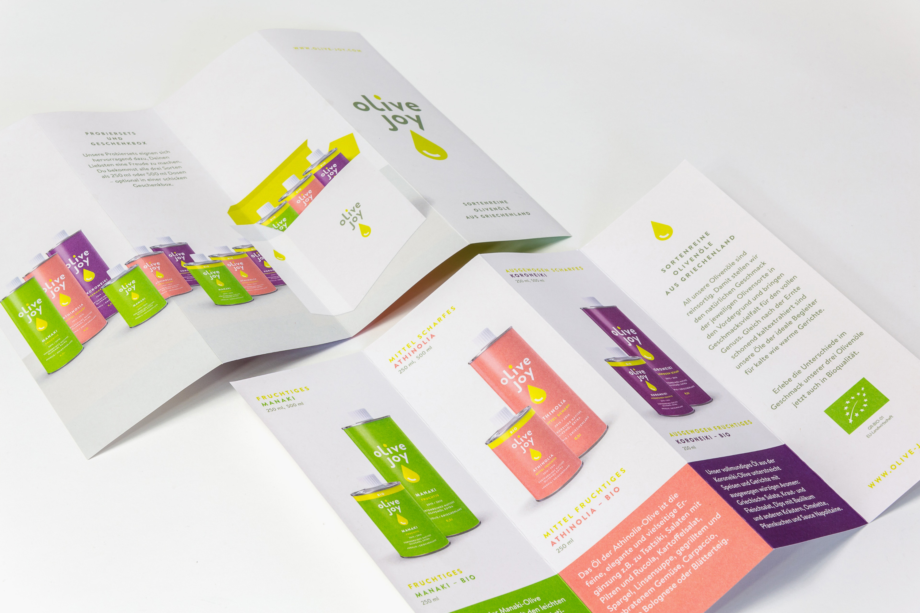
Flyer

Scroll ↑